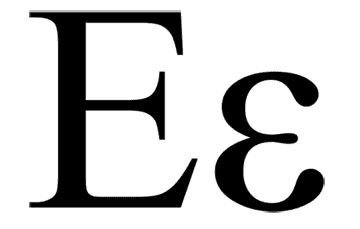
A few months ago I worked on creating a calling card for someone lucky enough to have both their first and last name begin with 'E.' Now, the letter 'e' isn't necessarily exciting en and of etself,* but when such symmetry exists it provides an immediate design possibility that, at the very least, must be attempted.**

I began by playing with the arms of the uppercase E as branches on a tree diagram that would lead to words that described qualities of the client. This only really makes sense with a sans-serif font and, as I had two E forms to work with, the potential existed for six lines leading to six qualities. After laying this out in a variety of ways I realized that the idea was conceptually bloated and inappropriate for the immediacy of a calling card.

On to the next idea— an abstracted cloud formed from a staggered stack of E forms. I chose Ed Benguiat's Edwardian Script ITC because the sweeping capital E had a lyrical and classic feel, which makes sense considering the fact the Benguiat was a consummate musician who designed his typefaces in the old days when you actually had to put pen to paper to realize a font (as opposed to electronic stylus to Wacom, or pen tool to virtual art board, or however it's done these days).
The resulting shape struck me as fantastically elegant and I loved it unconditionally.

Too bad it looked like a black rain cloud. And black rain clouds are depressing. They make for very poor calling card iconography. Changing the color didn't really help either and in the end I had to accept that I'd created a lovely little design element that would only be useful in some future design project. Then I became depressed; verifying that black rain clouds really are a bummer.
In the end, another design featuring floral dingbats became the calling card and I shelved the cloud. But I can't let it go. It has taken up residence on my desktop until I find a reason for its existence. Perhaps someone will eventually want a project that emphasizes silver linings.
*The worst alliteration ever.
**Although such immediate design solutions can also be traps if you can't shake them and experiment with other ideas or forms.


2 comments:
Jeffrey - have been pondering your cloud dilemma and I feel that with a well placed double 'e', as two nostrils (required to make one nose), you would have an excellent calling card for Napoleon (who was Enemy of England).
Hannah - After carefully considering your proposal I believe that you are correct; this graphic could work as an abstracted portrait of the man and his wild hair. However, were Napoleon to commission a calling card I'd probably be compelled to create a visual allusion to dynamite. Obviously.
Post a Comment