Showing posts with label typography. Show all posts

7.11.2009

The Best: Phone Conversation on Film


Ariana and I watched Dr. Strangelove, or: How I Learned to Stop Worrying and Love the Bomb the other night. Apart from being fantastically lit, carefully composed, wickedly funny, and boasting the sweetest credit typography* I think I've ever witnessed, it also has the single best phone conversation ever written for film (between the President of the United States, one of three roles in the film played by Peter Sellers, and Soviet Premiere Dimitri Kissoff). As there is no actor playing Kissoff in the movie, Seller's character does all the talking. He brilliantly manages to convey every word Kissoff must be uttering on the other end of the line over the course of two hilarious conversations— I can't recall the last time I saw anything on film half as smart.

*Even those who didn't like the movie still give props to the typography. . .

12.30.2008

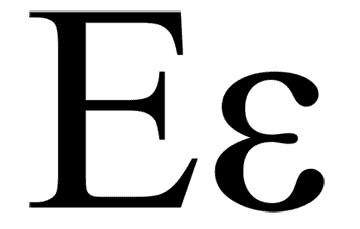
The Symmetry of E


A few months ago I worked on creating a calling card for someone lucky enough to have both their first and last name begin with 'E.' Now, the letter 'e' isn't necessarily exciting en and of etself,* but when such symmetry exists it provides an immediate design possibility that, at the very least, must be attempted.**

I began by playing with the arms of the uppercase E as branches on a tree diagram that would lead to words that described qualities of the client. This only really makes sense with a sans-serif font and, as I had two E forms to work with, the potential existed for six lines leading to six qualities. After laying this out in a variety of ways I realized that the idea was conceptually bloated and inappropriate for the immediacy of a calling card.
On to the next idea— an abstracted cloud formed from a staggered stack of E forms. I chose Ed Benguiat's Edwardian Script ITC because the sweeping capital E had a lyrical and classic feel, which makes sense considering the fact the Benguiat was a consummate musician who designed his typefaces in the old days when you actually had to put pen to paper to realize a font (as opposed to electronic stylus to Wacom, or pen tool to virtual art board, or however it's done these days).

The resulting shape struck me as fantastically elegant and I loved it unconditionally.


Too bad it looked like a black rain cloud. And black rain clouds are depressing. They make for very poor calling card iconography. Changing the color didn't really help either and in the end I had to accept that I'd created a lovely little design element that would only be useful in some future design project. Then I became depressed; verifying that black rain clouds really are a bummer.

In the end, another design featuring floral dingbats became the calling card and I shelved the cloud. But I can't let it go. It has taken up residence on my desktop until I find a reason for its existence. Perhaps someone will eventually want a project that emphasizes silver linings.

*The worst alliteration ever.

**Although such immediate design solutions can also be traps if you can't shake them and experiment with other ideas or forms.

9.29.2008

Sloth


Here is a bit of 5th grade free-association during a discussion of Dicken's A Christmas Carol. Sloth being one of the seven deadly sins. Bob (not Cratchit), Jimmy, and Goerge [sic] being quasi-mythical nonsense characters of tremendous importance to the younger contingent of my class. Peperika being, I can only assume, a spice on par with those carted over desert lands by the wise men during the rule of Herod.

What is it about the unchecked lettering of children that is so mesmerizing? All of my artistic training and typographic inclinations couldn't yield letter forms with one tenth the personality of these. How is it that this composition looks like the inchoate foundation for a lost Cy Twombly painiting and yet stems from nothing more than a child pushing time forward with  a few flicks of the fountain pen.*

*Yes, at my school, students still use fountain pens. It is part of our old-world approach to nurturing a more conscientious craftsmanship. 

7.10.2008

Helvetica: The Movie


I watched Helvetica last night. Again.

My initial viewing in my Beginning Design class left me with impressions only, and I wanted to revisit the film after a few months of dealing with typography, grids, and visual hierarchy. I’m assuming that I don’t differ from most fledgling graphic designers (an acceptance of reality that undoubtedly does separate me from the majority of fledgling graphic designers) and I’ve been using Helvetica as the default font for every project I’ve taken on.* As many of the eccentric pillars of the design community** mention in the film, Helvetica is clean, ubiquitous, and safe to use on just about any project. It won’t make waves and you’ll appear to know what you’re doing. Really, if it’s good enough for the majority of corporate America, it’s probably good enough for my homework assignment.

Now, if you’re reading this and not a graphic designer, then you’re probably scratching your head at this point and wondering if it’s even possible to make an hour and a half movie about a font. I assure you it is. Helvetica is such a powerful cultural force at this point that whole books have been devoted to it (in a cultural critique kind of way, not in the sense that it is the font for the book, although there are those examples as well). One of the most interesting things my instructors stated in the afore mentioned design class was that an understanding and appreciation of typography is “what separates the designer from the desktop publisher.”

Statements like this seem to be bandied about in the design world all the time. As Helvetica points out, designers are an opinionated lot. Ironically, they are all right in some way so, like most heated debates, the question over Helvetica’s prominence and use will continue ad nauseam. In the meantime I will be sharpening my typographic vocabulary (ascender, serif, x-height, et al) and compiling three fonts that will work for every*** project, and three fonts to perpetually vilify. Watch out Comic Sans, I’m coming for you.

*But I only used Helvetica in the beginning: in every instance but one (when I was designing a movie poster for Helvetica, appropriately enough) it was transformed into a different font that seemed to better suit the content. I don’t want you thinking I’m a one-trick pony so early on in my career. Becoming that pony takes at least a few years in the professional world.

**Old skool
Massimo Vignelli, naughty David Carson, and the chillingly astute Stefan Sagmeister to name a few.

***Ahhh, type crime! You never just hit the bold button to fatten up some highlighted text. Big design no-no! This just adds weight to all the edges of the letter forms without a commiserate handling of the white space between the letters. Such an action brands you as the amateur that you are. It’s akin to using iWeb as your web design and blogging program.